Dew Drop Swap
In 2017, game designer Jennifer Scheurle started a Twitter thread, asking designers to share mechanics that are “hidden” from players. The thread included a number of fascinating anecdotes:
- The last bit of health in Assassin’s Creed is worth more hit points than the rest
- The vehicles in Hi-Octane handle exactly the same, despite having different stats
- The first shots from an enemy in BioShock always miss
- When facing more than two enemies in Half-Life, only two will attack while the others run to random locations
- The last bullet in your gun in System Shock does more damage
- If you keep dying in Resident Evil 4, the game will spawn less enemies
A majority of the replies focused on tweaking a game’s difficulty in service of the player’s experience: ensuring a player doesn’t feel overwhelmed, or cheated, or that a battle was too easy.
In fact, adjusting difficulty to suit a player’s experience is common in video game design. Many platformers implement a feature called “coyote time” or “ledge tolerance”, allowing a player to successfully jump a few frames after leaving a ledge. First person shooters often include aim assist, guiding bullets or slowing down a player’s crosshairs to ensure they hit a target. The Mario Kart series is famous for its rubber banding: slowing down your fellow racers and giving you better items when you’re falling behind.
These invisible mechanics make sense: the purpose of a video game is to provide a particular experience for a player. Of course a designer will fudge a few numbers if it makes a person feel like they barely survived an intense encounter or handily dispatched a swarm of enemies.
However, this necessarily undermines video games as objective tests of skill. How can we judge the abilities of a person playing Max Payne, for example, if the game adjusts enemy health based on how well a player is doing? If someone takes advantage of the fact that off-screen enemies in Devil May Cry won’t attack by strategically positioning the camera, is that cheating?
How do we reconcile a game presenting a challenge for us to overcome as a player while simultaneously adjusting the parameters of that obstacle so that the challenge is perfectly suited to our abilities? Is that still a challenge? Which version of the challenge is the real one?
A similar question has continually resurfaced in the debate over whether or not an “Easy Mode” should be added to the infamously brutal FromSoftware games (Dark Souls, Sekiro). As Spelunky designer Derek Yu, argues, the intense challenge is thematically central to these games and adding different difficulty modes would cause players to miss this core experience entirely. FromSoftware game director Hideta Miyazaki corroborates this in an interview with GameSpot: “We feel if there’s different difficulties, that’s going to segment and fragment the user base.”
Of course, this ultimately implies that the difficulty of these games is tuned with a specific type of player in mind. As Steve Spohn writes, this ignores players with disabilities, who may have the determination and will to overcome the game’s obstacles, but are physically unable to do so. This purist view of game difficulty also leaves out people with different levels of video game experience: couldn’t the “Easy Mode” of a brutal video game actually result in the intended experience for someone with less skill?
And, as Patrick Klepek explains, this notion of a game’s “true” difficulty is spurious even for seasoned gamers: how do we make sense of cheesing enemies, enemies accidentally killing each other, random glitches, holding controllers awkwardly, cheat codes, mods, game guides, trading controllers with your friend, in the context of beating a game the “right” way?
There’s a tension here between the popular notion that games provide a singular, objectively defined experience that can reliably measure a player’s ability and the reality that the individual experience of playing a video game is a squishy confluence of a number of factors, including the designer’s intentions, the player’s actions, the game’s mechanics, the player’s environment, and so on.
This is a familiar tension; we see it outside video games all the time. Universities still rely on SAT and ACT scores as predictive measures of college success, despite the tests favoring the wealthy. Doctors rely on supposedly neutral medical instruments, like the spirometer, which are calibrated with the assumption that white people are superior. Camera lenses struggle to capture black and brown skin tones, machine learning algorithms make racist associations. In all of these examples, there is a supposedly neutral something—a test, an instrument, a challenge—that just so happens to validate the superiority of a certain group of people. In reality, however, this something has been designed specifically with that group in mind.
Through this perspective, video games become a useful tool for exploring privilege and bias: in the same way that video games are designed to focus around the player’s experience, the world outside video games is also often designed to fit the experience of a specific person (specifically, a wealthy, white, straight, cisgendered, non-disabled man). Where video games use ledge tolerance, aim assist, and rubber banding to center the player, society uses redlining, gendered pay gaps, heteronormative tax breaks, and broken elevators to center the privileged.
In developing Dew Drop Swap, I wanted to create a game that actively refuses to center the player experience. More specifically, I wanted a game that includes all of the mechanics to center the player’s experience, but then refuses to let the player enjoy them. A game that humiliates and frustrates the player’s perception of their own ability, insisting the player acknowledge the experience around them as designed.
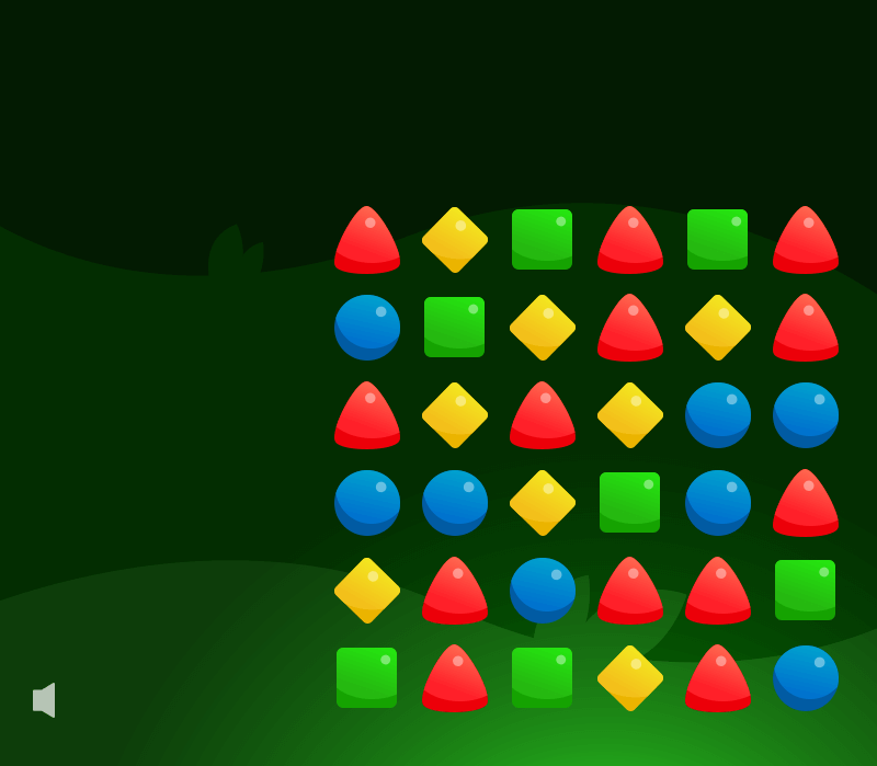
When Dew Drop Swap begins, a Guide appears in the form of a small leaf, announcing to the player that the Dew Drop Kingdom is in peril and the only person who can save it is you, The Player. And how will you save it? By collecting dew drops in a match three-style game, of course.
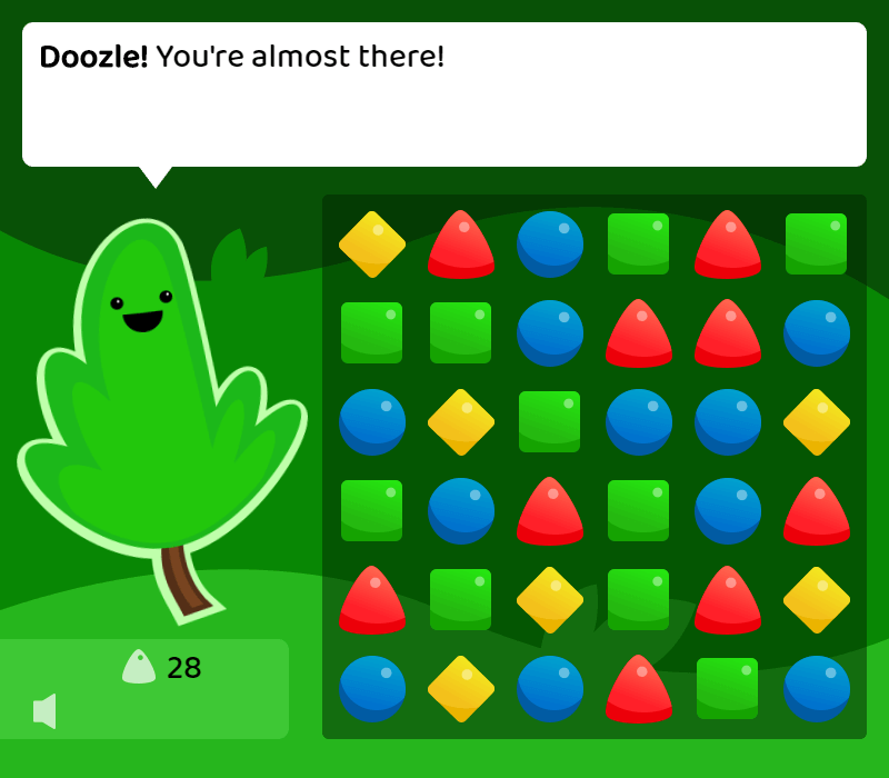
During the first couple of levels, basic mechanics are introduced (combos, a timer) while the Guide enthusiastically showers you with compliments (“Oh doozle! You’re amazing!”). Cheerful music plays alongside the juicy pings of each successful match.
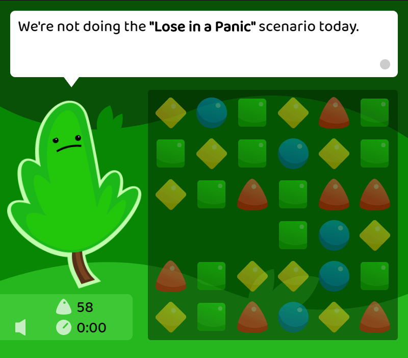
And then, in a jarring shift from this saccharine introduction, you’re given an abruptly difficult challenge: collect 100 dew drops in 30 seconds. As the round starts, the timer immediately starts flashing to indicate you’re almost out of time. You start swapping, moving as quickly as you can. Getting a few isolated matches here and there, but no combos. In a panic, you select the wrong dew drop, hopelessly swapping two mismatched colors only to watch them limply return to their original positions. And, then, finally: you stumble into a string of combos, the match sound rising in pitch as each dew drop falls into place.
But through that celebratory din of this combo, you suddenly hear the warning click of the timer, letting you know there’s only ten seconds left. 10. You only have 40 points. 9, 8. That’s not even halfway there. 7, 6. You’ll never make it. 5, 4. Maybe if you got another combo? 3, 2. Wait. 1. No. 0.
As the timer hits zero and the player braces for a familiar “Game Over” screen, the Guide suddenly frowns in confusion, explaining:
“Wait, wait, sorry, hold on.”
“We’re not doing the ‘Lose in a Panic’ scenario today.”
And then unceremoniously shuttles you onto the next level.
From here on out, Dew Drop Swap shifts, from a game that centers you as its hero to a game that centers you as its hero while excessively telling you it’s centering you. In one level, you’re told in advance you’ll get combos more easily, robbing you of any feeling of self-satisfaction. In another, the timer only advances as you get matches, creating perfect dramatic timing while diminishing your agency as a player.
Dew Drop Swap is also a game that frames your role as the player as a kind of act, in concert with the game. In one round, you’re asked to simply wait while a perfect match sits in front of you, the conceit being that you’re too downtrodden after a few losses to notice the match. But then, in the last 30 seconds, you do notice it. And, to help sell the fiction, the Guide stops the timer and disables most of the tiles to ensure only the perfect match is selectable.
All that’s left is for you to play your role as the hero.
Showing this game to people, I was hoping, perversely, for frustration: I wanted the game to feel like it was taking or undermining something that games usually provide freely. Agency, control, a power fantasy. And some did feel that way: a few expressed aggravation at the Guide, wanting to find some way to undermine them or resist the way the game continues to pull you forward.
But, surprisingly, many others felt the complete opposite, finding joy in the game. They found the overall experience fun or thought the Guide was endearing. Instead of a lack of agency, one person found the game encouraging; to them, the over-the-top constraints felt like helpful guidance on how to improve in the game.
It’s worth noting that I started working on this game in April 2019. That means for a year and a half I’ve been focused on a project intended to make someone feel humiliated. And I’ve been playtesting this game over and over, at times feeling clever and satisfied as it took shape, but ultimately putting myself through that same experience of humiliation over and over.
And, of course, I built this game with a specific audience in mind. I built it with myself in mind. I built it with other white men in mind. I built it as a game that would subvert and question the ways in which video games shape themselves around me as the player. I built it as a tool to remind myself of the ways in which the world violently contorts itself to privilege my existence.
But at what point does something like this become performative self-flagellation? Who benefits from a year and a half of my own self-induced humiliation? In a year filled with pain, why did I make a game intended to cause more of it?
At the end of Dew Drop Swap, the Guide leaves and the score display disappears. The background music stops and the lights turn off. It’s just you and the grid of dew drops. You can keep matching for as long as you want, but there’s no dialogue, no score, no reward.
It’s meant to serve as a calm respite where the player can finally regain their agency, on their own terms.
But, having playtested it over and over, it sometimes just feels empty. After the barrage of self-aware tricks, I was alone. And, with no more guidance or external validation, I’m forced into asking myself: what’s the point? Who is this game for? A game made by a white man with white men in mind with the purpose of questioning the privileging of white men in society via a medium that privileges white men? Did I make a game to make myself feel worse to make myself feel better?
Spending a year and half explicating my own humiliation into a game, it seems natural for it to end this way: just me and the grid of dew drops I designed, swapping them back and forth to admire the easing I chose, musing on the agency I cleverly designed the game to take away from myself, reflecting on the insightful critiques about myself I weaved into the game. Just me and this game I designed about me, alone.
At the center.