Create an Iframe Portal
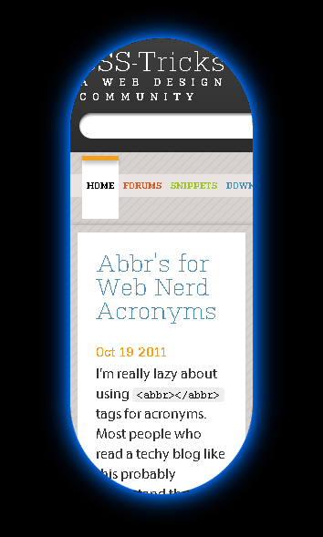
To get a little practice with CSS3 keyframe animations, let’s do something a little strange: create an iframe portal like the portals in Portal. Check out the demo in either Firefox or Chrome (click anywhere to shoot a portal). Here’s a screenshot of the the end result:

To start, let’s make an iframe that looks like a portal. Here’s our markup:
<div class="portal-wrapper">
	<iframe src="" frameborder="0" scrolling="no" class="portal"></iframe>
</div>
We need the wrapper div so that we can expand the dimensions of our portal from the center (this will make sense in a minute). Here’s the CSS:
.portal-wrapper
{
	display: none;
	height: 500px;
	position: absolute;
	text-align: center;
	width: 200px;
}

.portal
{
	border-radius: 100px;
	box-shadow: 0 0 10px #0071F5,
			0 0 20px #0071F5,
			0 0 40px #0071F5,
			0 0 60px #0071F5;
}
If you’re like me, you might be wondering: wait, we can use border-radius on an iframe? Yeah, apparently you can and it works pretty well. We use a high border-radius to round the edges and use multiple box-shadows to create a soft blue glowing effect.
If we wanted this to look more like a portal from the actual game, then we would probably want to use an inset box-shadow to make the glow appear over the actual content of the iframe. However, this won’t work with an iframe (it just doesn’t display).
Now let’s set up the animations. First, we’ll create an animation for opening the portal:
@-webkit-keyframes portal-open
{
	0%
	{
		margin-top: 250px;
		height: 0;
		width: 0;
	}

	100%
	{
		margin-top: 0;
		height: 500px;
		width: 200px;
	}
}
With this declaration, we are creating a simple animation (called “portal-open”) that expands the portal from no width and height to its full size. We also animate the top margin so that the portal will expand from the center. We apply that animation with the following CSS:
-webkit-animation-name: portal-open;
-webkit-animation-duration: 1s;
-webkit-animation-timing-function: ease;
We can summarize that in one line:
-webkit-animation: portal-open 1s ease;
Let’s create another animation:
@-webkit-keyframes portal-active
{
	0%
	{
		box-shadow: 0 0 10px #0071F5,
					0 0 20px #0071F5,
					0 0 40px #0071F5,
					0 0 60px #0071F5;
	}

	50%
	{
		box-shadow: 0 0 0 #0071F5,
					0 0 10px #0071F5,
					0 0 30px #0071F5,
					0 0 50px #0071F5;
	}

	100%
	{
		box-shadow: 0 0 10px #0071F5,
					0 0 20px #0071F5,
					0 0 40px #0071F5,
					0 0 60px #0071F5;
	}
}
With this animation, we dim the surrounding box-shadow and then revert it to create a light glow animation around the portal’s edges. We’ll apply it with the following CSS:
-webkit-animation-name: portal-active;
-webkit-animation-duration: 1.5s;
-webkit-animation-timing-function: linear;
-webkit-animation-iteration-count: infinite;
We can also get this down to one line:
-webkit-animation: portal-active 1.5s linear infinite;
Now we just add the following to our CSS to trigger both animations:
-webkit-animation: portal-open 1s ease,
			portal-active 1.5s linear infinite;
Of course, we’ll want to trigger these animations through JavaScript. There’s a few different ways we could do this. We could attach the animation properties to elements in the CSS and then flip the animation-play-state from “paused” to “running.” However, the specification suggests that this property may eventually be deprecated and we can’t easily reset an animation with this property.
An alternative method would be to simply add the CSS animation properties using JavaScript. But this is messy; we want to keep our CSS separate from our JavaScript.
Our last option is to toggle the animation-name property. With this method we can declare everything in our CSS and then toggle that property within our JavaScript:
$(function() {

	var PORTAL_HEIGHT = 500;
	var PORTAL_WIDTH = 200;

	var ANIM_PORTAL_OPEN = 'portal-open, portal-active';
	var ANIM_PORTAL_CLOSE = 'portal-close';

	var $portalWrapper = $('.portal-wrapper');
	var $portal = $('.portal');

	$(document).click(function(event) {

		// Clear the animations
		$portal.css({
			'-webkit-animation-name': ANIM_PORTAL_CLOSE,
			'-moz-animation-name': ANIM_PORTAL_CLOSE,
			'-ms-animation-name': ANIM_PORTAL_CLOSE,
			'animation': ANIM_PORTAL_CLOSE
		});

		// Retrieve the User's mouse position
		var mouseX = event.pageX;
		var mouseY = event.pageY;

		// Position and display the portal
		$portalWrapper
			.hide()
			.css({
				'top': mouseY - PORTAL_HEIGHT/2,
				'left': mouseX - PORTAL_WIDTH/2
			})
			.show();

		// Trigger the animations
		$portal.css({
			'-webkit-animation-name': ANIM_PORTAL_OPEN,
			'-moz-animation-name': ANIM_PORTAL_OPEN,
			'-ms-animation-name': ANIM_PORTAL_OPEN,
			'animation': ANIM_PORTAL_OPEN
		});

	});

});
Since we declared everything in our CSS (including the animation-name), we need to add a completely different value (“portal-close”) to clear the animations. If we provide a blank value, the animation-name property will default to the value defined in our CSS, which will keep our open animation from resetting.