Responsive Whales
Logan Franken| Logan Franken | |
| @loganfranken | |
| goo.gl/oed3yY | |
| goo.gl/MLwIhD |
Images
What Do We Have?
Fluid Images
img { max-width: 100%; }Examples
So What's Wrong?
Same image, despite context
What Do We Need?
- Dimensions
- File Size
- Pixel Density
- Art Direction
- Bandwidth
Pssh, So What?
This is Easy
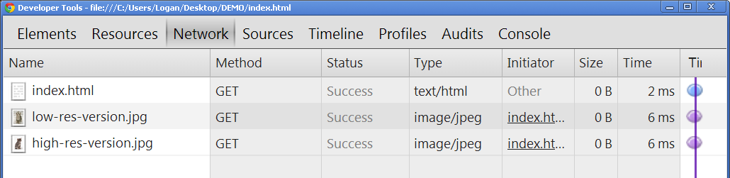
<img src="low-res-version.jpg" class="low-res" />
<img src="high-res-version.jpg" class="high-res" />
.high-res { display: none; }
@media (min-width: 1000px) {
.low-res { display: none; }
.high-res { display: block; }
}Preparsing
Solutions
Background Images
.banner { background-image: url('low-res-version.jpg'); }

@media(min-width: 1000px)
{
   .banner { background-image: url('high-res-version.jpg'); }
}
Server-side
Serve images through a server-side handler
Adaptive Images uses a cookie
Hosted Services
Serve images through a third-party hosted service
JavaScript Swap
<img src="low-res-version.jpg"
   data-fullsrc="high-res-version.jpg" />
Use JavaScript to swap out with the appropriate version
Go Crazy
...with some clever hacks
File Formats
Is there a responsive file format?
Lower Level
What if the browser could provide more information about the device to the server?
GET /index.html HTTP/1.1
Client-Hint: device-pixel-ratio=2, viewport=1280x720, ...Extending HTML
srcset
<img src="high-res-version.jpg"
     srcset="low-res-version.jpg 1000w 1x,
	     low-res-version-hd.jpg 1000w 2x">
Compact media query-ish syntax
Picture
<picture>
   <source media="(min-width: 1000px)"
      srcset="high-res-version.jpg 1x,
              high-res-version-hd.jpg 2x">
   <source
      srcset="low-res-version.jpg 1x,
              low-res-version-hd.jpg 2x">
   <img src="low-res-version.jpg">
</picture>
Standard media queries with video-like syntax
Polyfills
- srcset: srcset-polyfill
- picture: picturefill
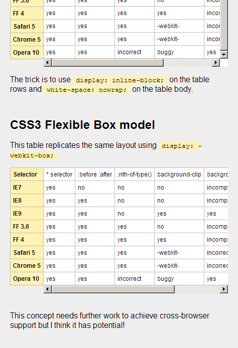
Tables
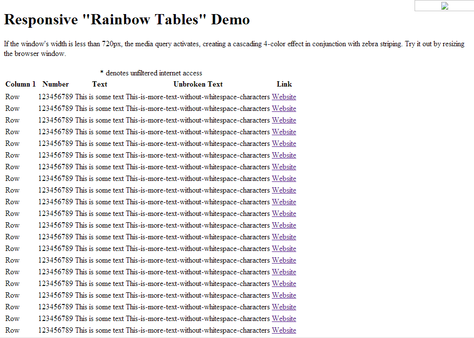
Problem
Responsive Forms vs. Data Readability
Solutions
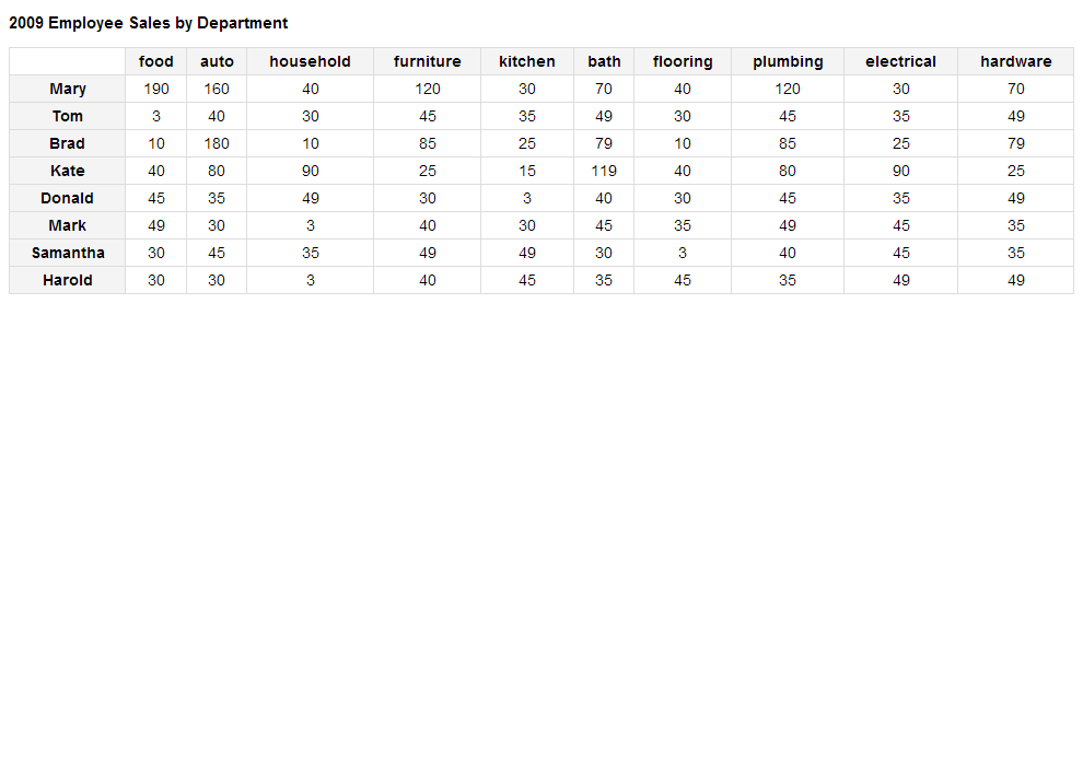
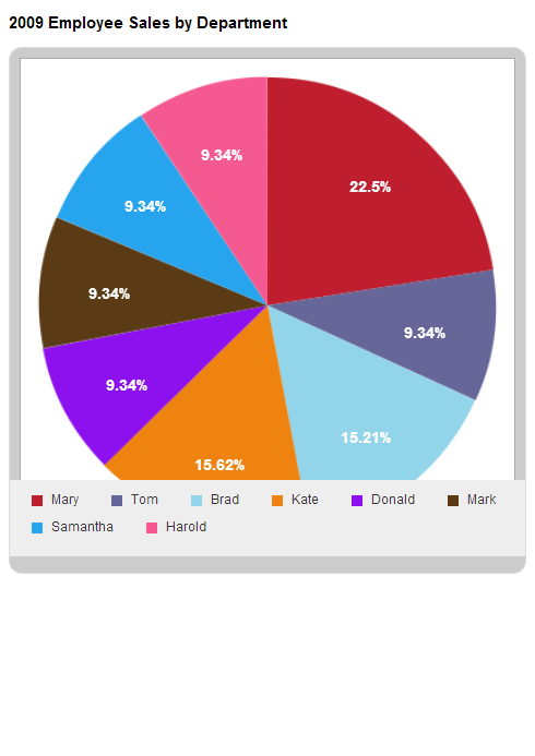
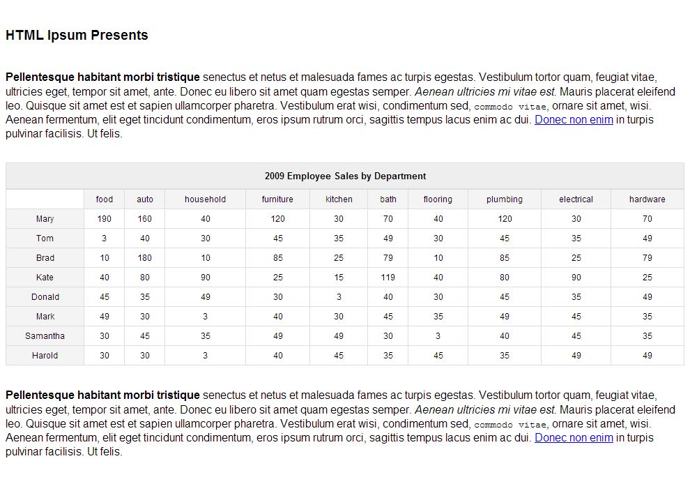
Chart Summary
(Scott Jehl: Create pie chart with jQuery Visualize)
 |
 |
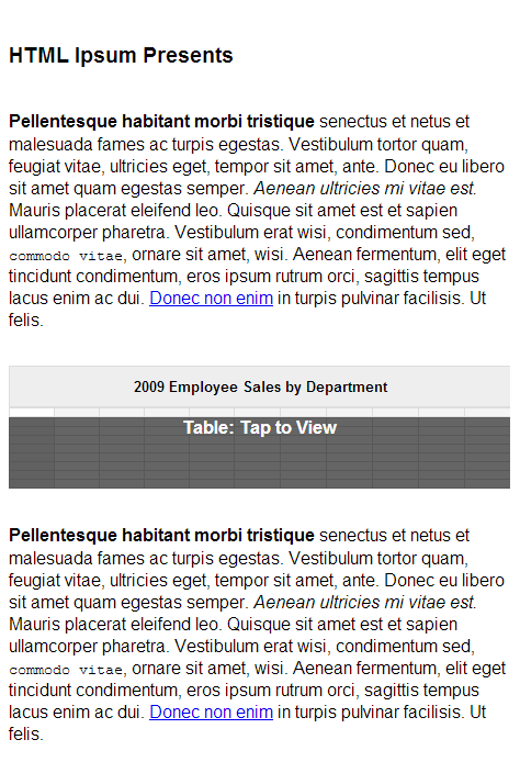
Link to Full Version
(Scott Jehl: Shrink table to mini version, click to expand)
 |
 |
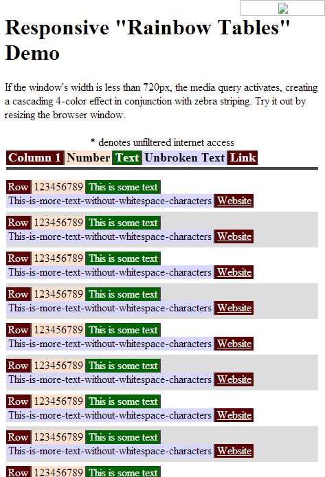
Color-Coded List
(Brad Czerniak: Color and inline everything)
 |
 |
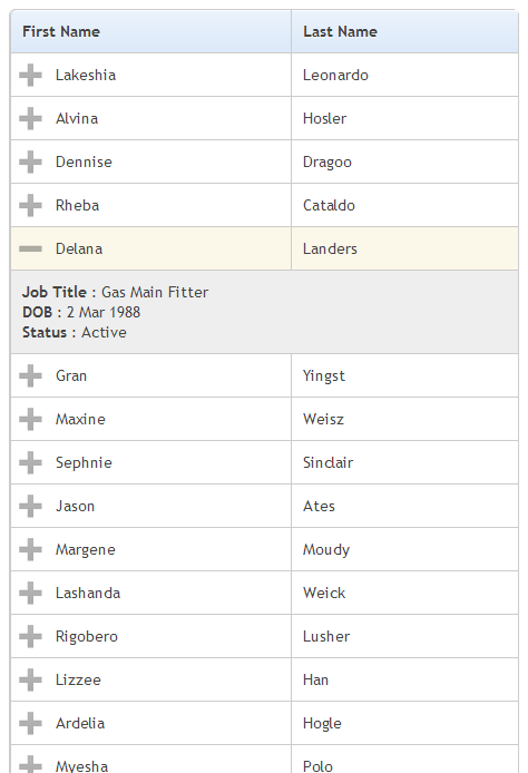
Expand-Collapse
(FooTable: Move data from marked columns into expandable rows)
 |
 |
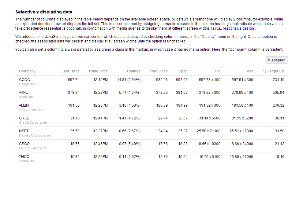
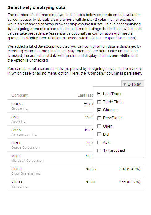
Hide Columns
(Filament Group: Hide columns marked with class)
 |
 |
Pinned Column
(David Bushell: Float thead and overflow tbody)
 |
 |
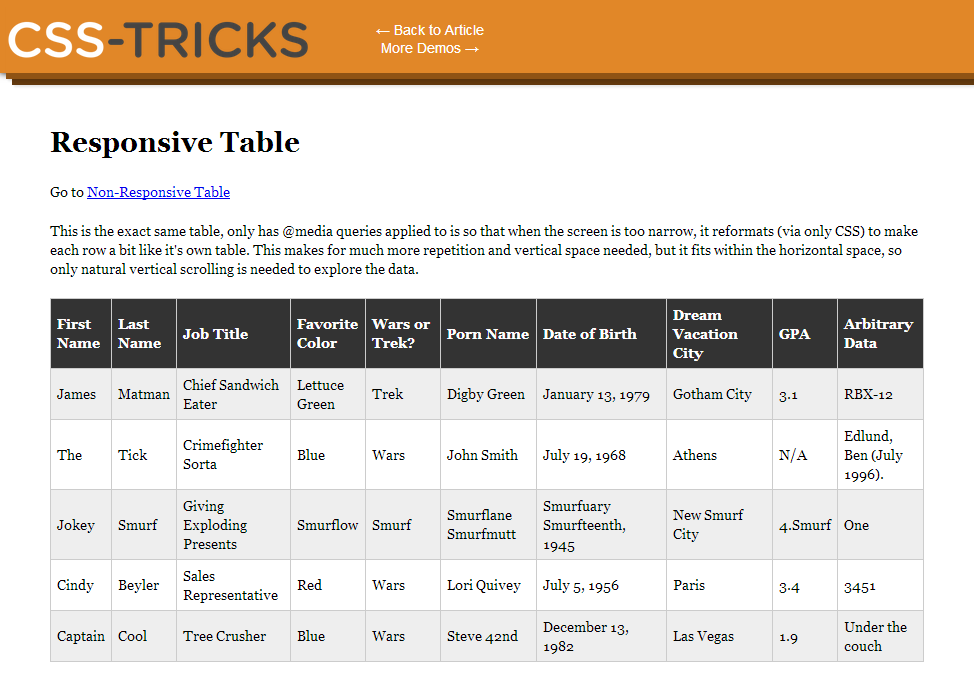
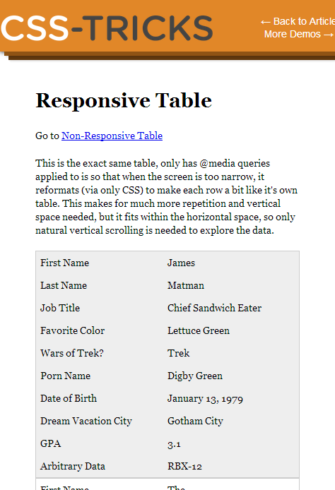
Linearized Table
(CSS Tricks: Inject column headers with td:before)
 |
 |